Vimeo Product Redesign
Redesigning Vimeo into one motion-driven, seamless flow.
About the Project
Vimeo had grown powerful but fragmented. Marketing videos constantly patched product visuals, revealing the need for a unified, cohesive experience. We decided to redesign the product itself, not just the campaigns, to make it visually clear, functional, and emotionally engaging.
The Challenge
Over nearly two decades, Vimeo had evolved into a powerful yet fragmented platform. Each product and tool felt separate, navigation was broken and inconsistent, and the interface had lost clarity and cohesion.
For marketing and product teams alike, every product video required redesigning the interface to make it visually coherent — a clear sign that the product itself needed deeper alignment.
Insights
While creating marketing videos and analyzing user behavior, we realized Vimeo’s experience wasn’t just cluttered — it was disconnected.
Navigation felt inconsistent, and creators often struggled to find what they needed.
Each video turned into a small redesign just to make the product clear.


The Solution
We set out to transform Vimeo into one intuitive, creator-focused experience. It became clear that instead of redesigning Vimeo for each product or video, we needed to redesign the platform itself—building a cohesive system that feels clear, functional, and emotionally engaging for every user.
Vision & Approach
↳ All interactions happen in one continuous space.
↳ Tools appear when and where they’re needed.
↳ Effects make the experience feel Cinematic.
↳ The Product is the Marketing
Early Explorations
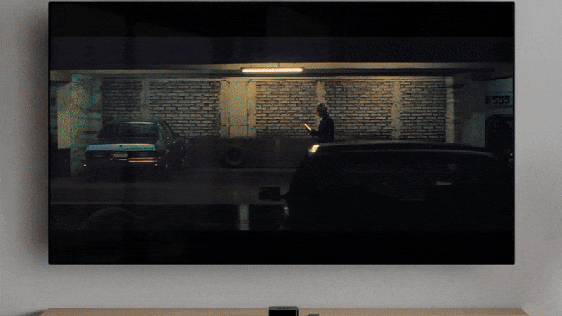
Instead of starting with wireframes, we began with motion — creating videos that simulated the full user experience. These explorations became a glimpse into Vimeo’s future, defining the direction for both design and user experience.
The concept video we presented wasn’t just a prototype; it became the foundation for Vimeo’s next chapter. It inspired the idea that AI is the new UI, shaping how we think about interaction and sparking the creation of Vimeo’s dedicated AI team.

Motion
Motion became the foundation of the redesign. By designing interactions as moving experiences rather than static screens, we created a platform that feels fluid, intuitive, and alive.
Motion guides users naturally through their workflow, highlights tools in context, and adds clarity without distraction. Subtle transitions, light, and layered depth transform navigation into something expressive and cinematic — every interaction feels connected, meaningful, and human.

Unified Design System
We built the Bokeh design system to unify components and interactions and reworked legacy code for scalability. Teams applied the vision consistently, creating a smooth, connected, and modern platform.
Facts
↳ 25% faster navigation and task completio
↳ Higher engagement
↳ Positive feedback from creators and partner
↳ Simplified marketing workflows
↳ Cohesive and intuitive user experience
↳ Scalable design system
Vimeo is now a single, fluid platform where every interaction flows naturally. The redesign unified the product, improved marketing efficiency, and established a foundation for growth and innovation.
Outcome